Benefitfocus
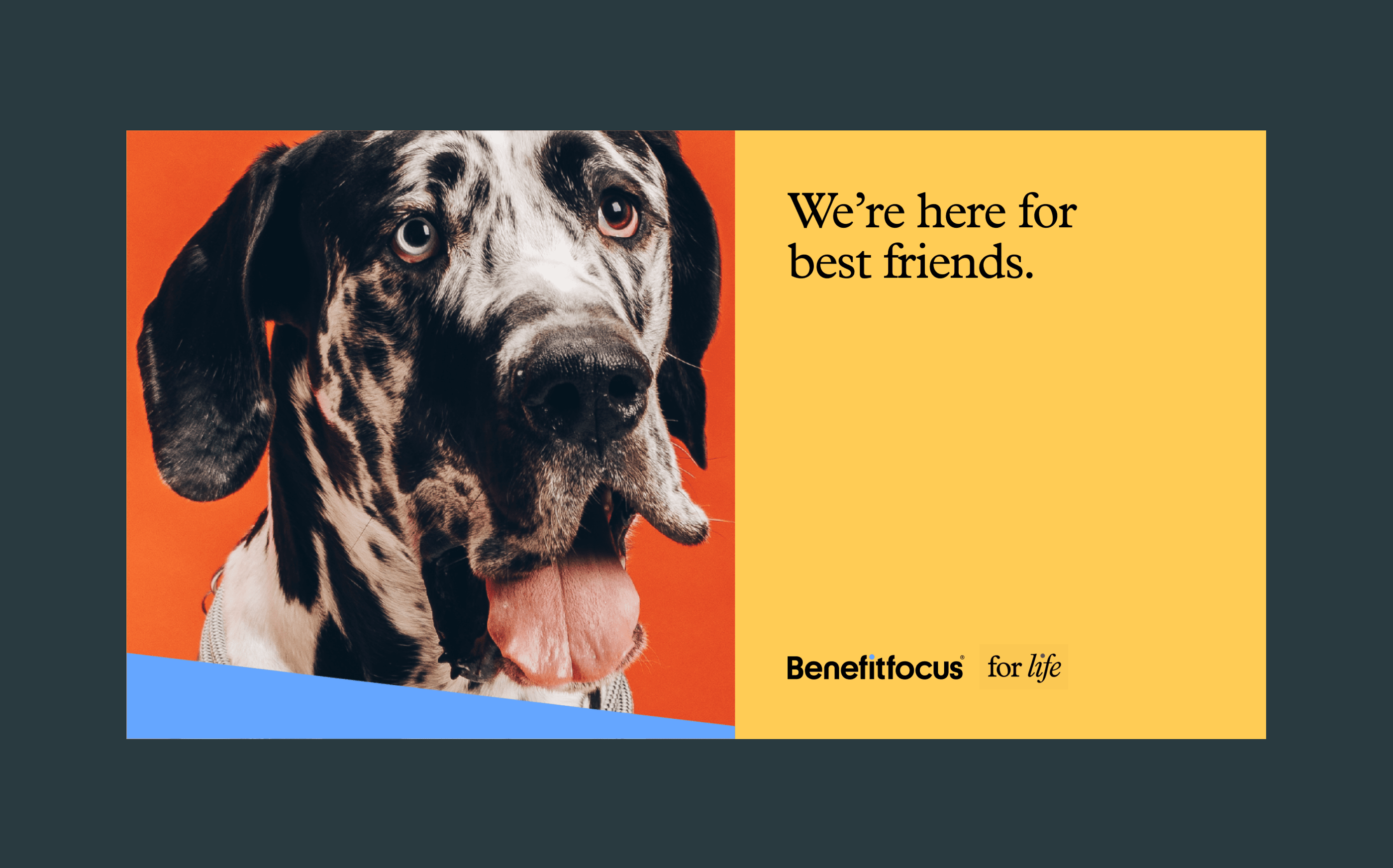
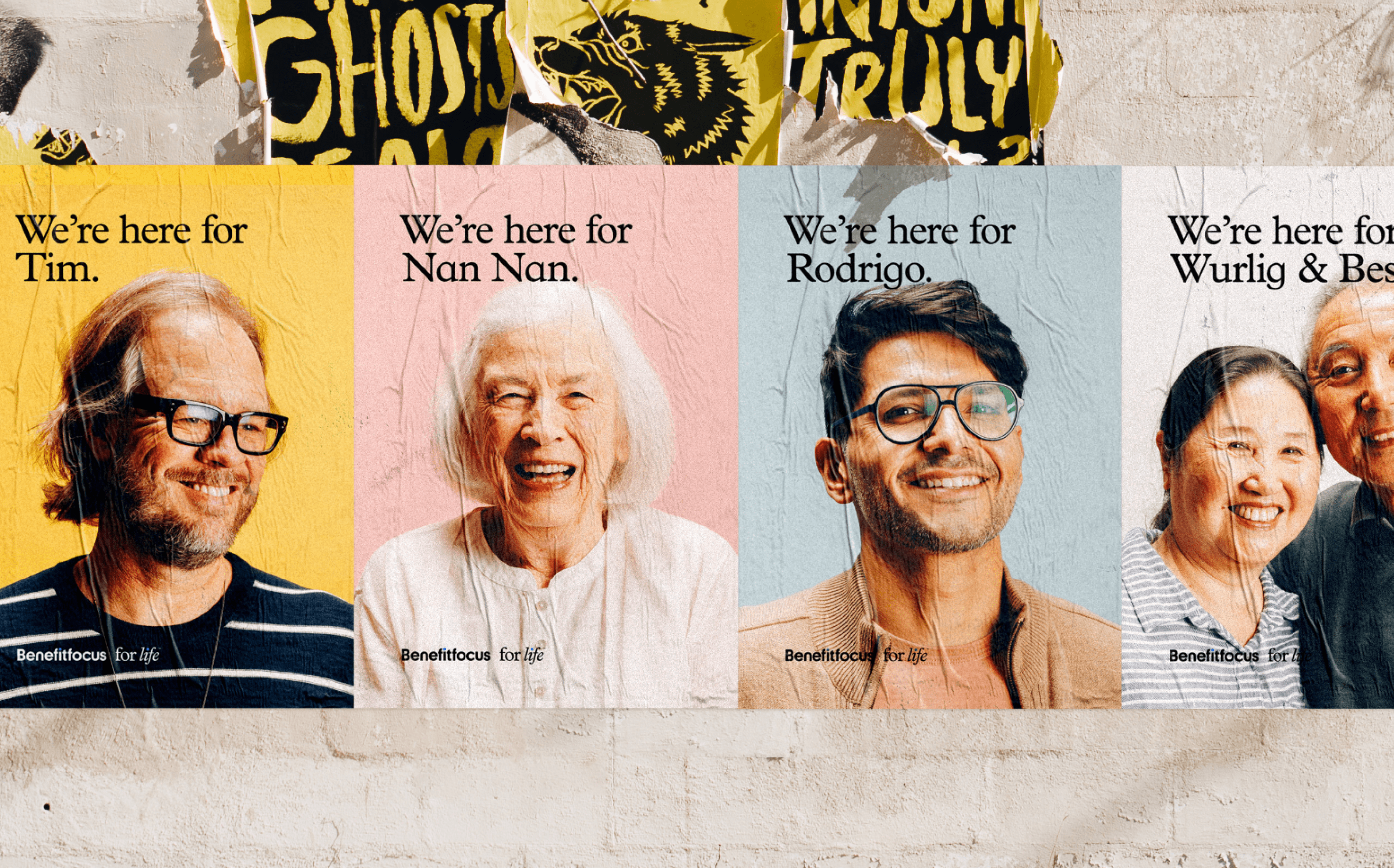
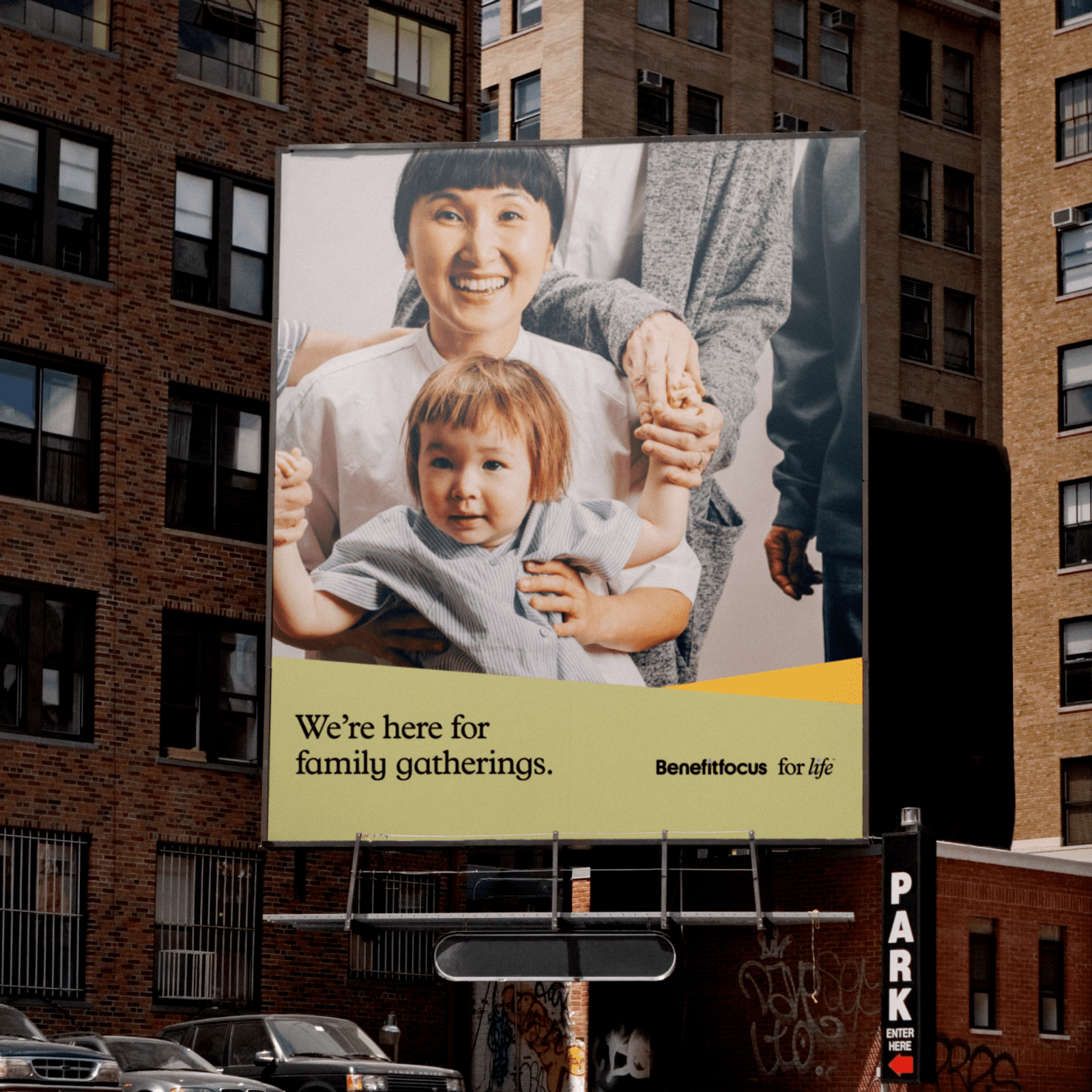
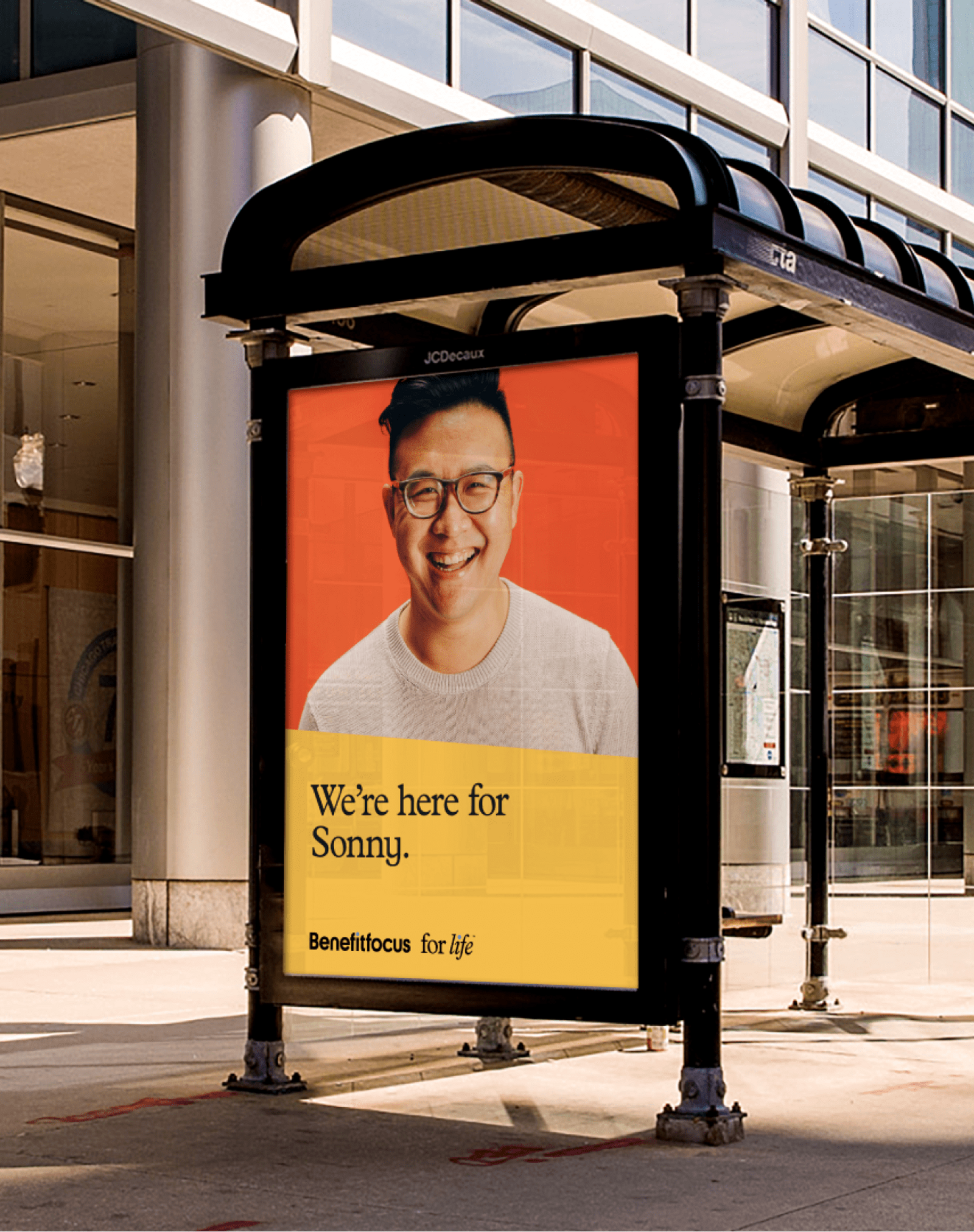
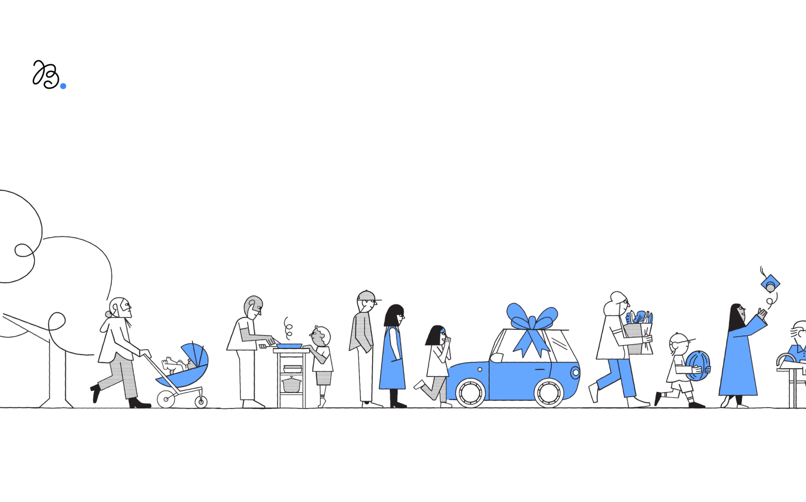
Survey says that 40% of people would rather clean their toilet than enroll in benefits. That’s a pretty incredible statistic that challenges us to rethink our benefits ecosystem. For 20 years Benefitfocus has been a leader in the industry, each year helping over 30 million Americans enroll in and manage their benefits. They are looking to change the industry and expand their B2B audience into a direct to consumer offering.
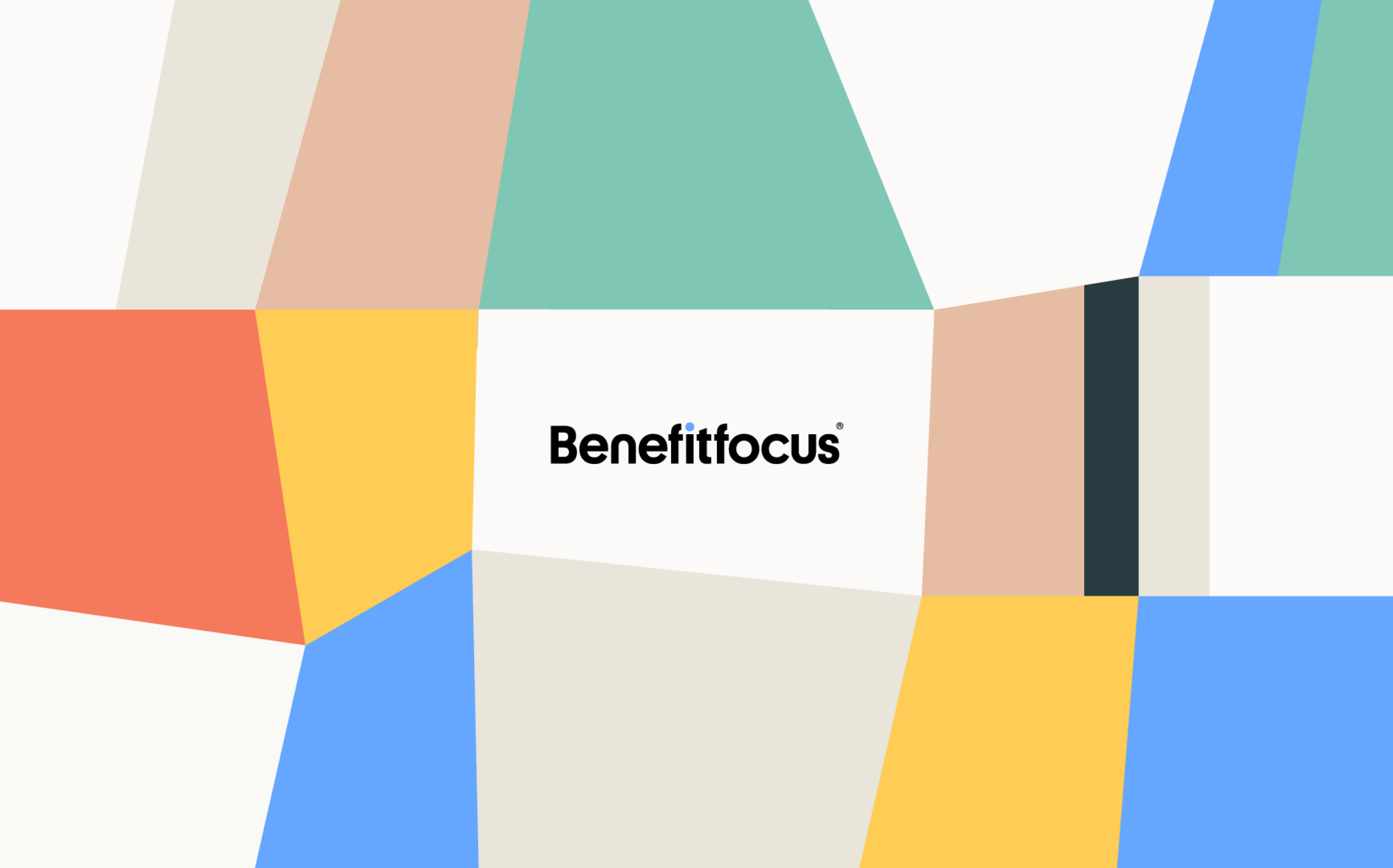
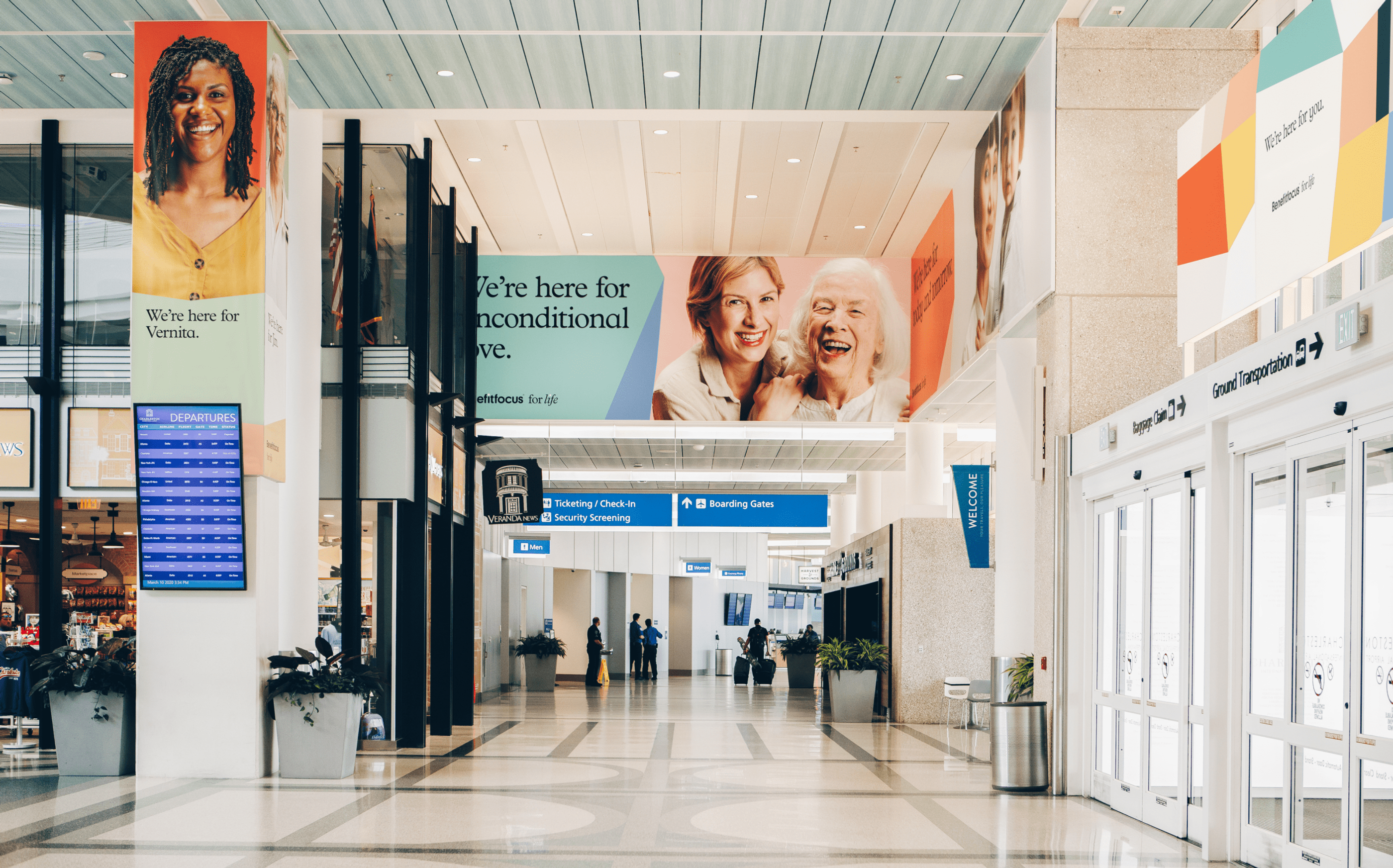
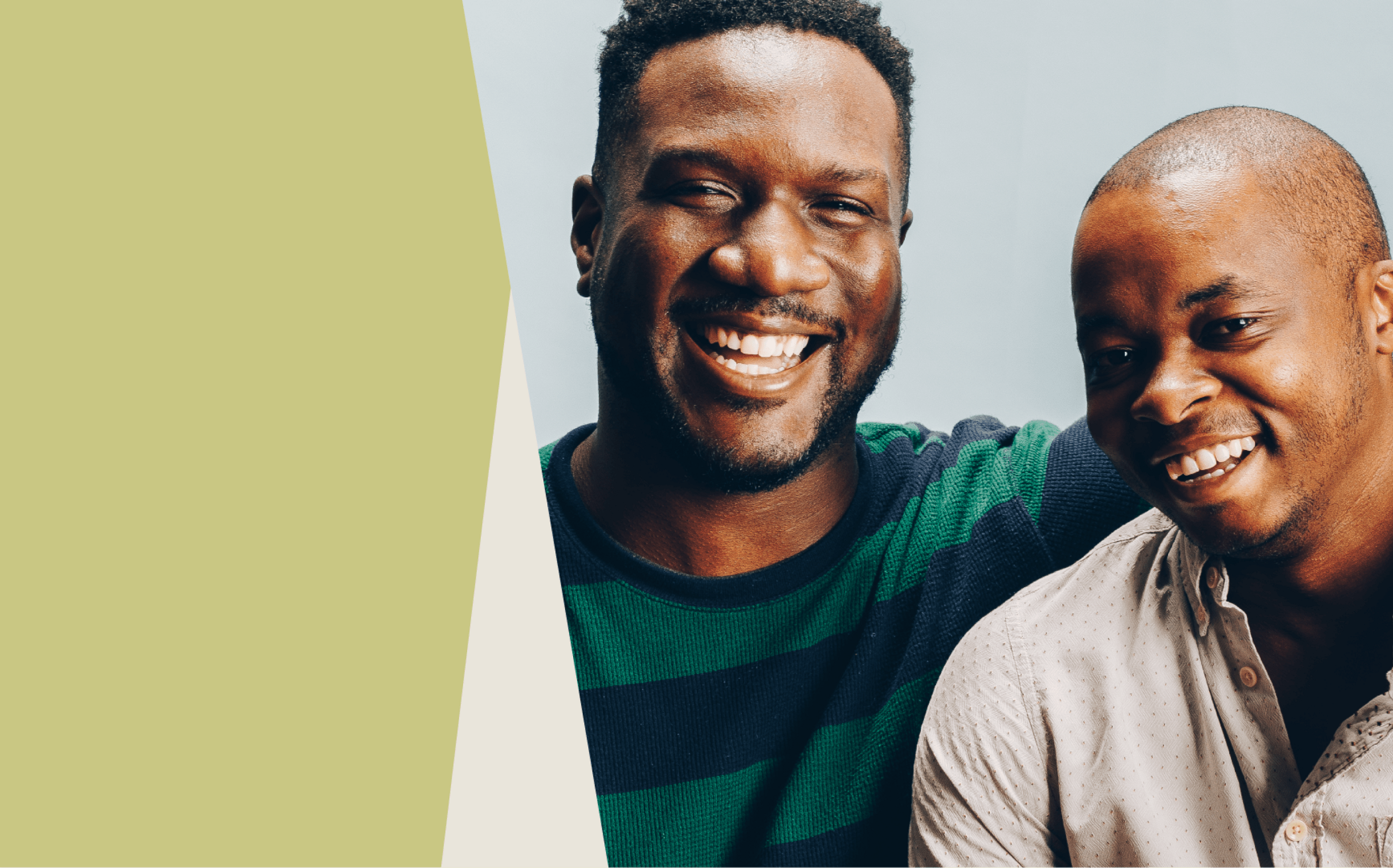
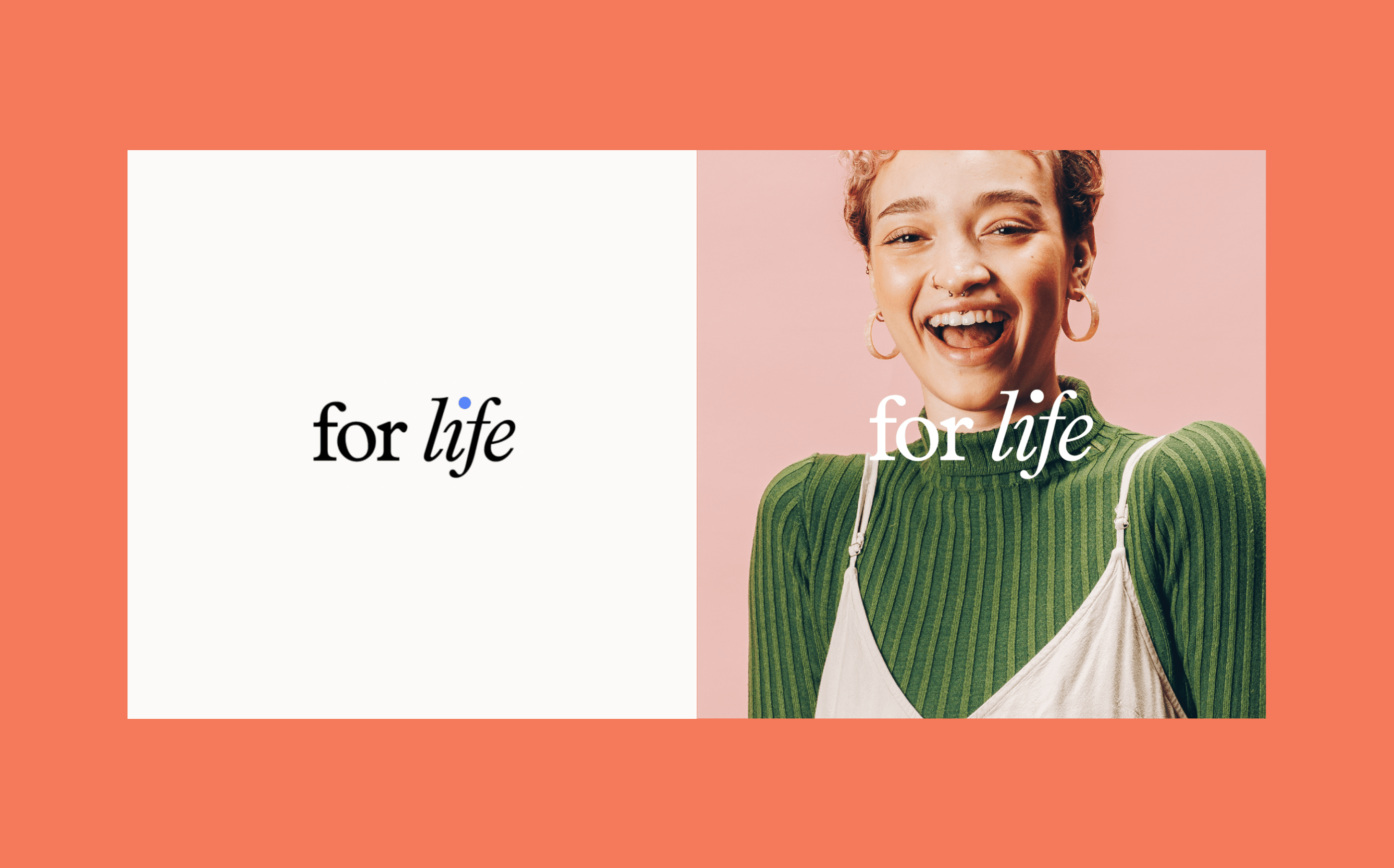
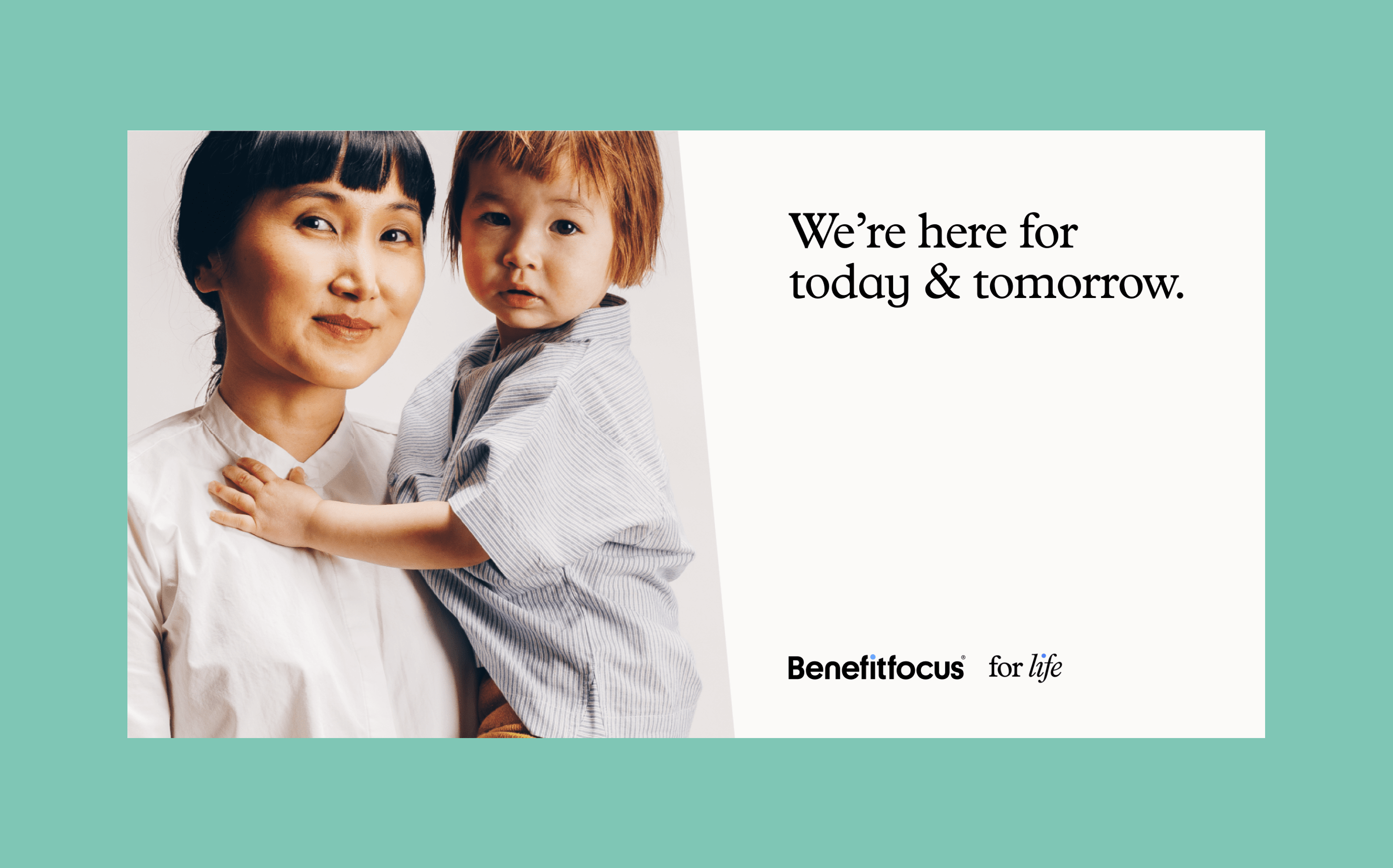
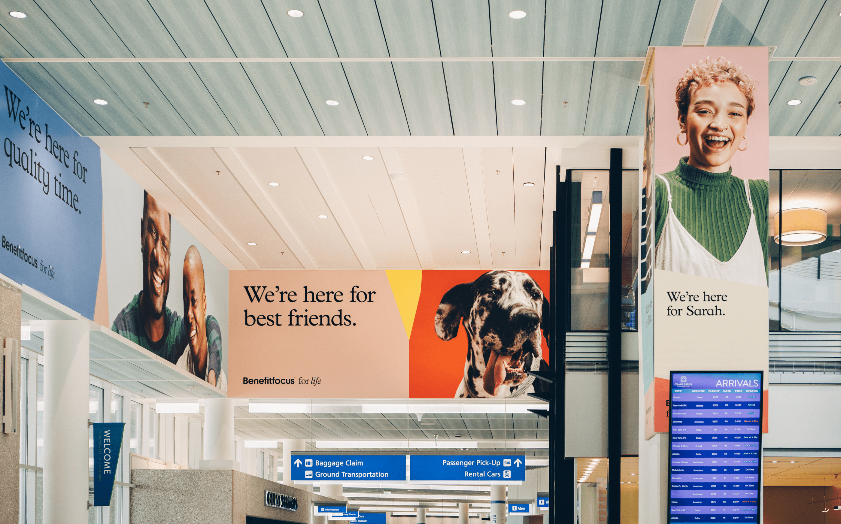
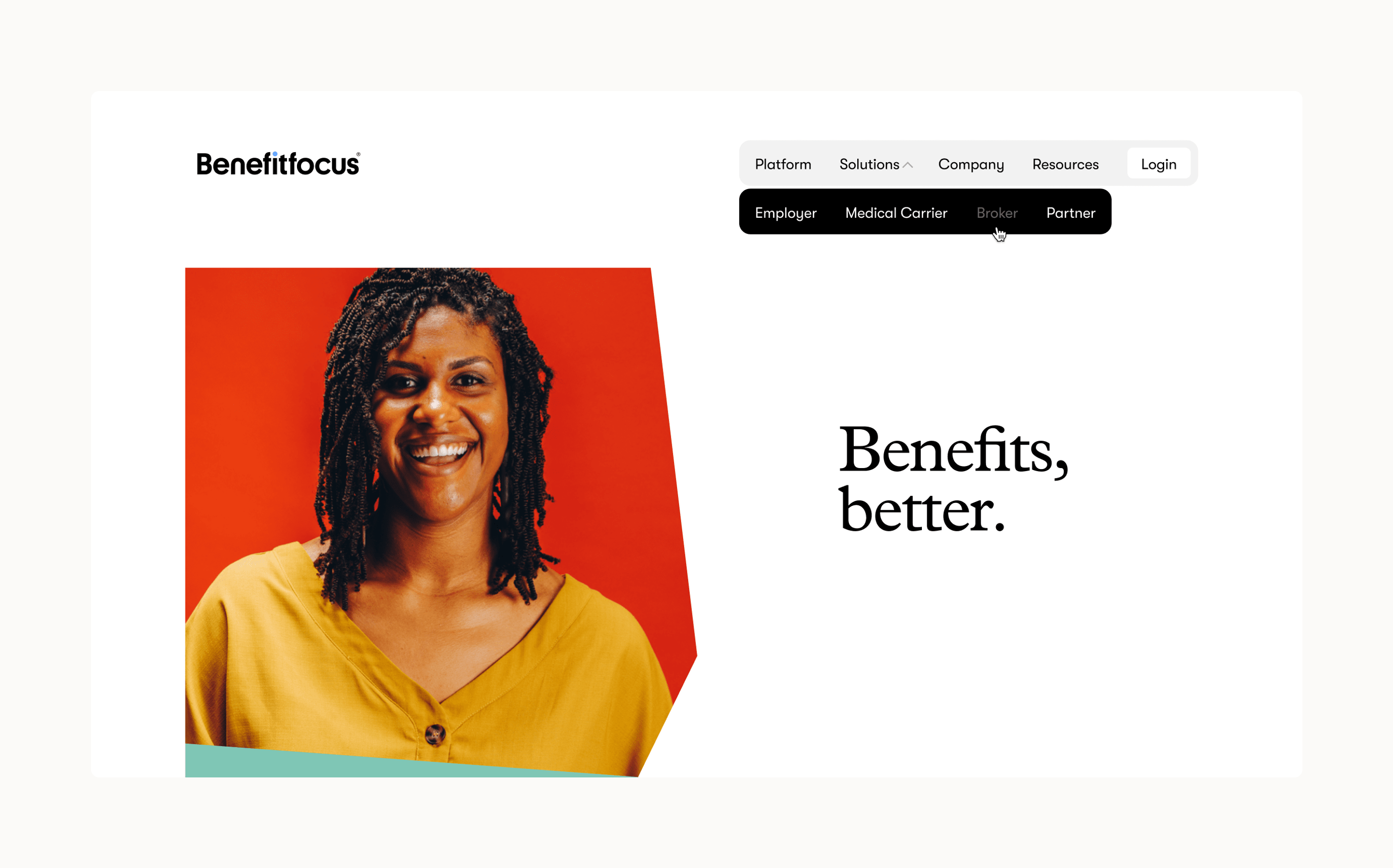
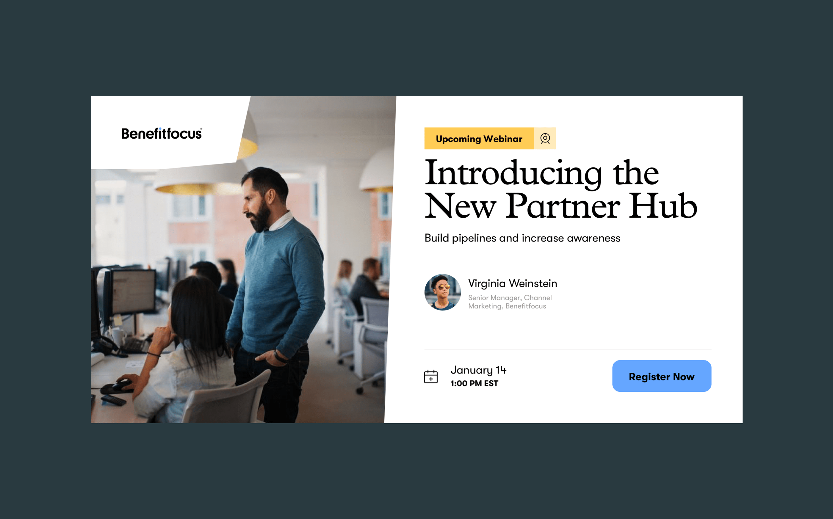
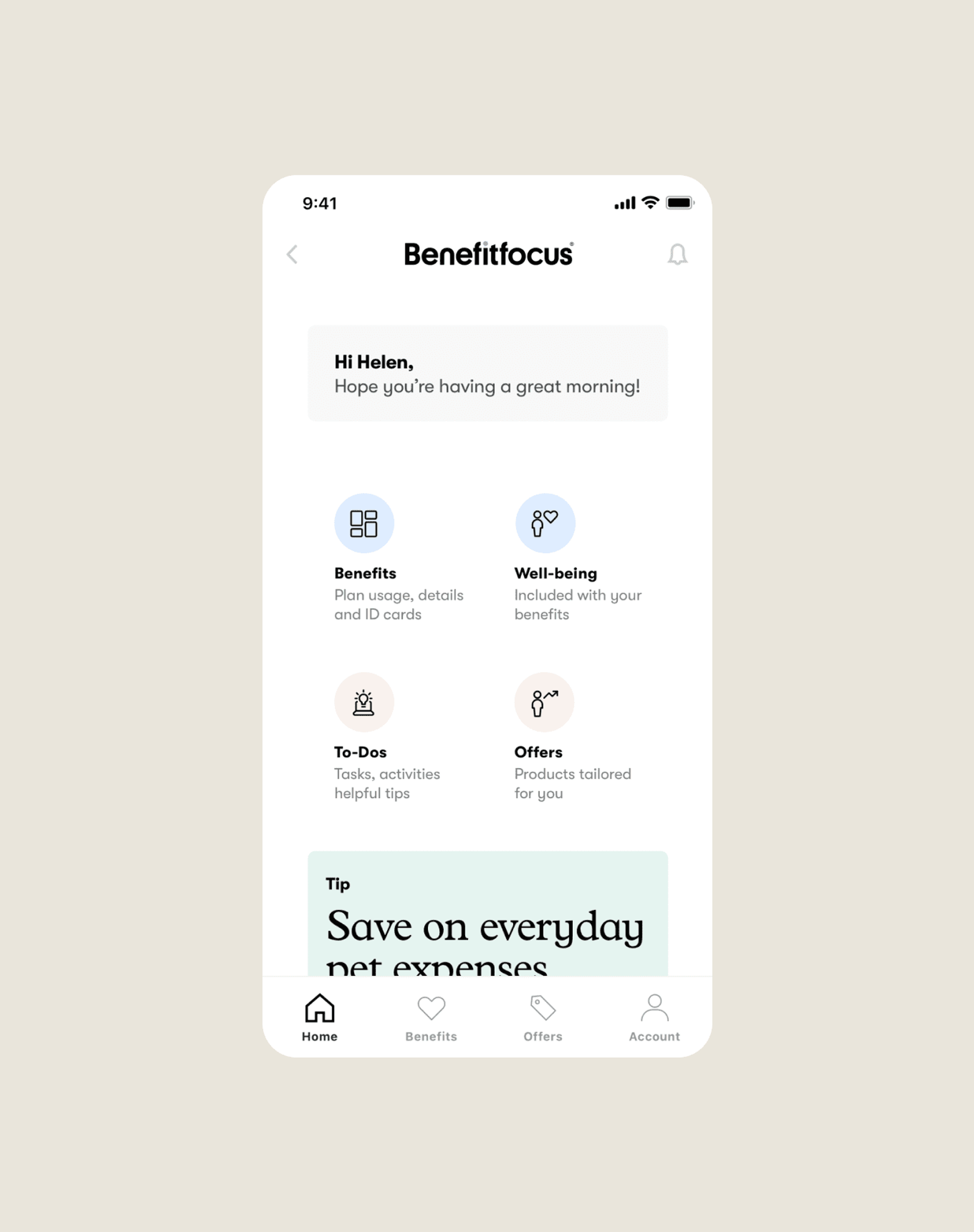
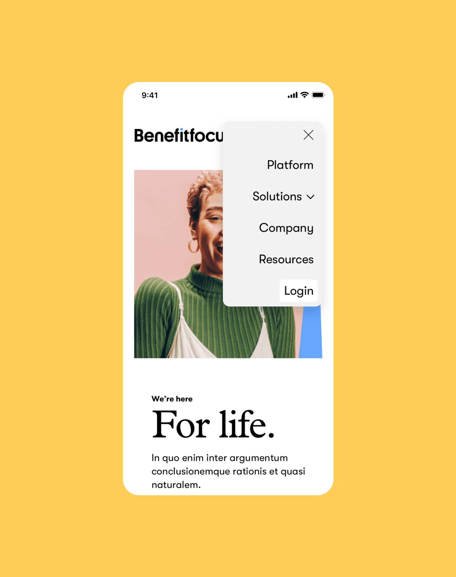
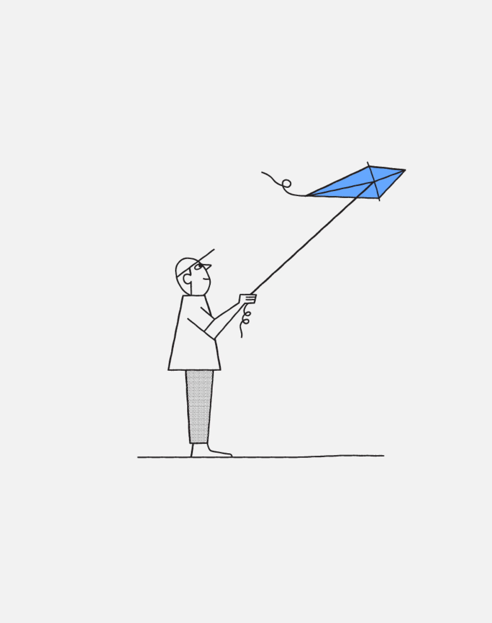
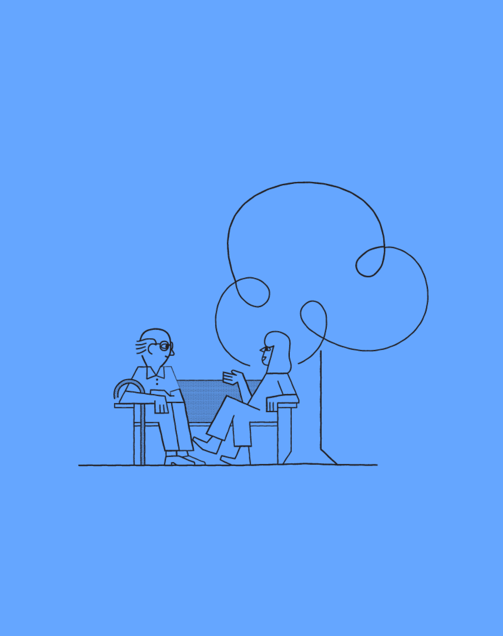
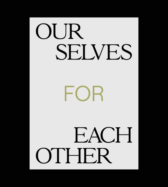
Previously managing an overwhelming field of logos representing brands and sub-brands, internal and external initiatives, the new logo introduces a friendlier, more approachable aesthetic and presents a cohesive, unified organization. The vision for a better benefits platform is one that adapts to your changing needs as you go through life’s stages, we introduced a tagline “for life” to share this outward. A scripted B stitches together all components of the brand and presents a more playful side of the identity. To bring in energy and warmth, we modified the existing color palette by introducing more saturated and vibrant colors, while type was narrowed down to two fonts throughout. Quilting is used throughout the launch campaign as a metaphor for piecing together all of the benefits that uniquely help every individual. This system highlights limitless possibilities, comfort and security. We extended our new branding through all digital channels, creating a set of templates and style sheets for each application. We built and worked from a single design library that housed all typographic styles, brand colors, icons and imagery needed to roll out across desktop, mobile, email, digital advertising and mobile app formats.