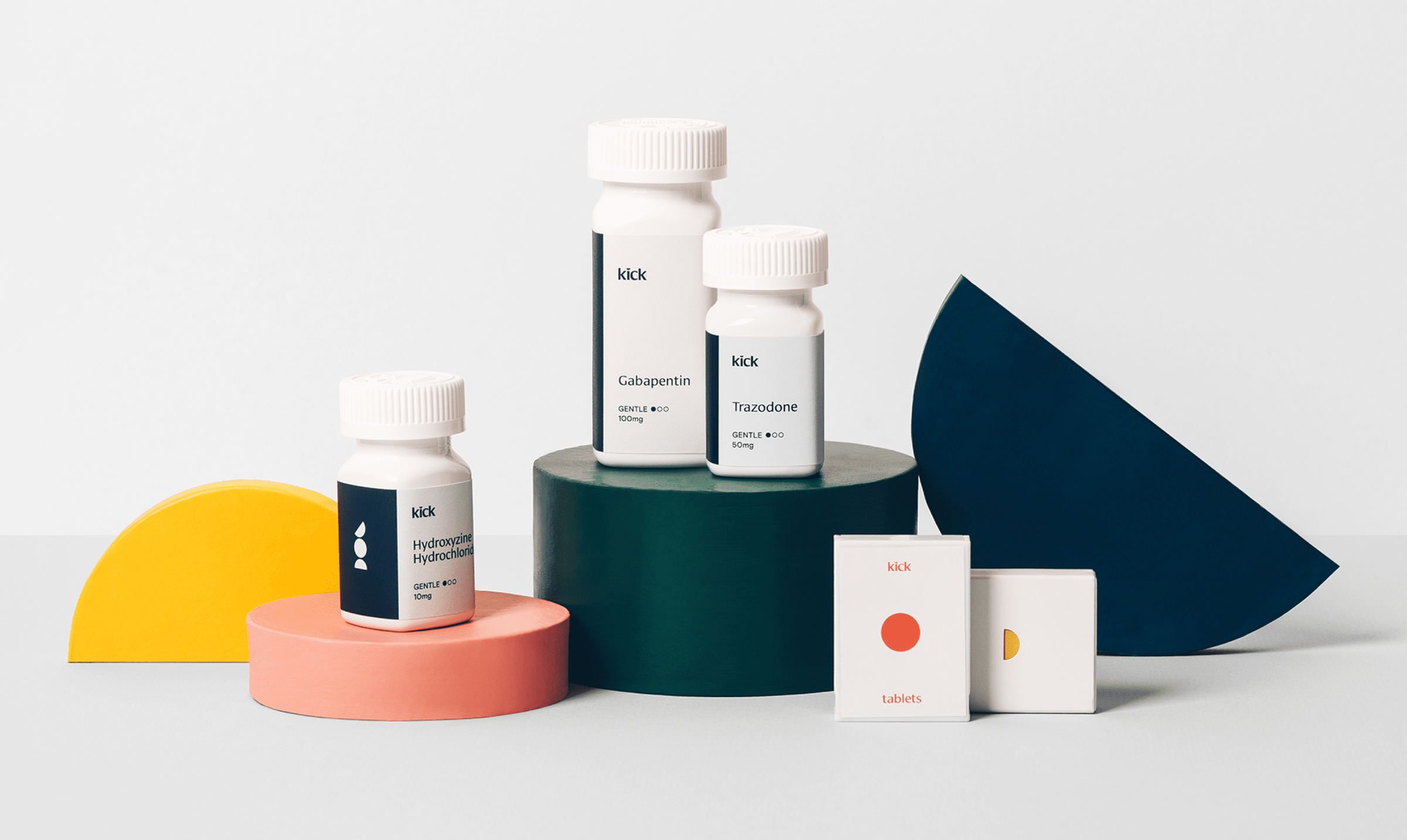
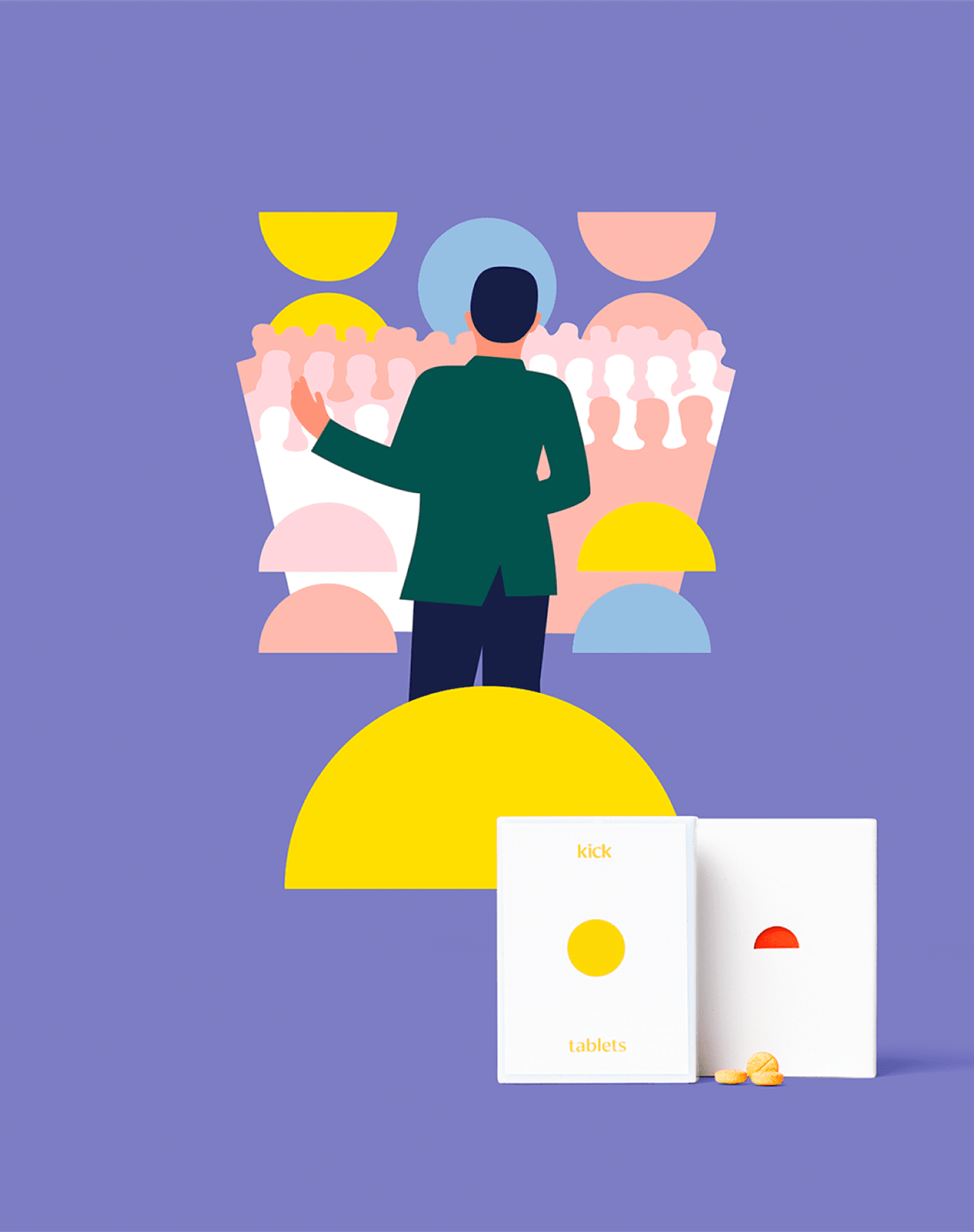
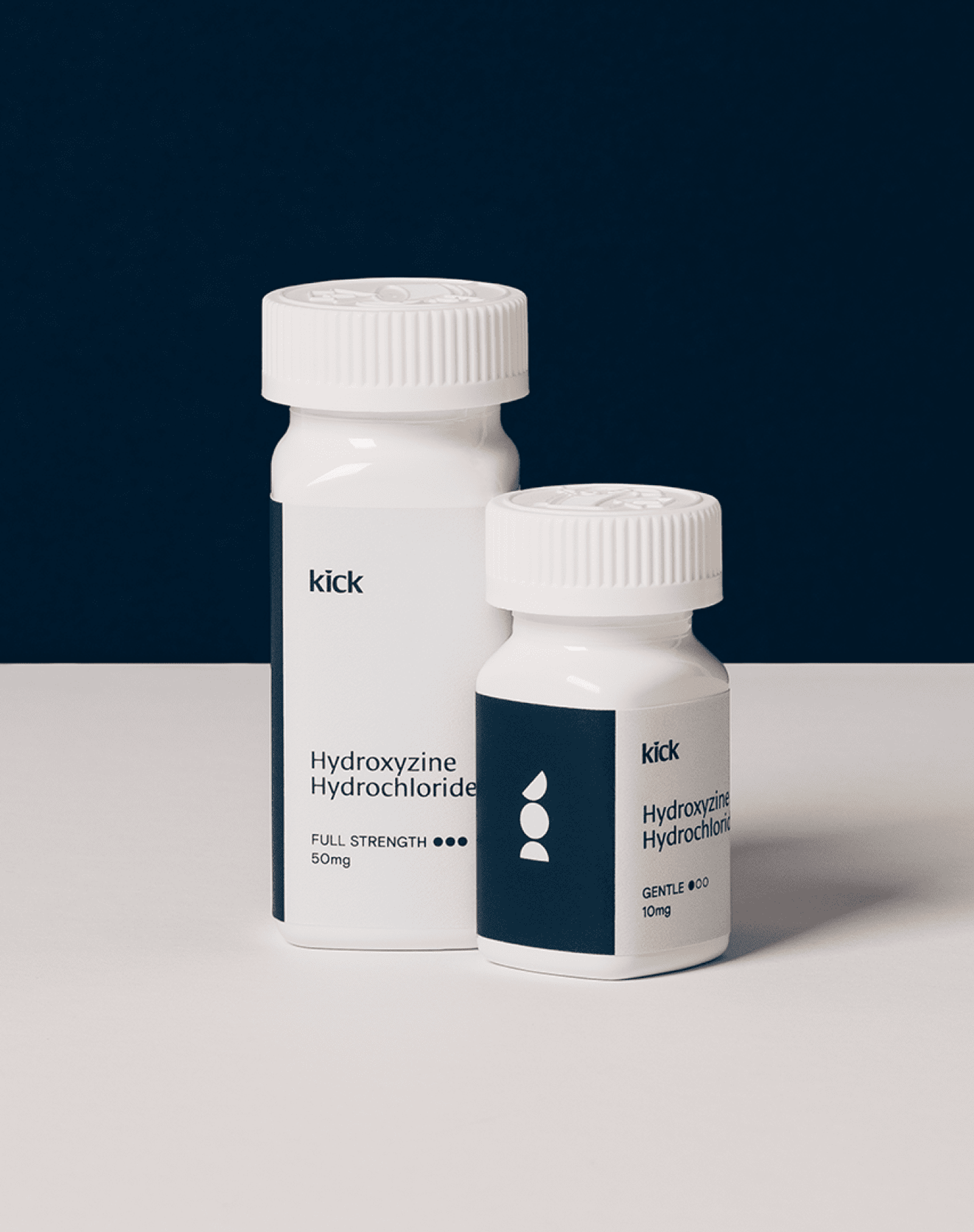
Kick founder, Justin Ip, came to Fuzzco to help him build a bold, trustworthy brand for his pre-launch consumer telehealth company. With a goal of helping people live confidently, Kick provides users with tactical solutions to treat situational anxiety including daily exercises and direct access to beta blockers, as well as holistic sleep solutions.
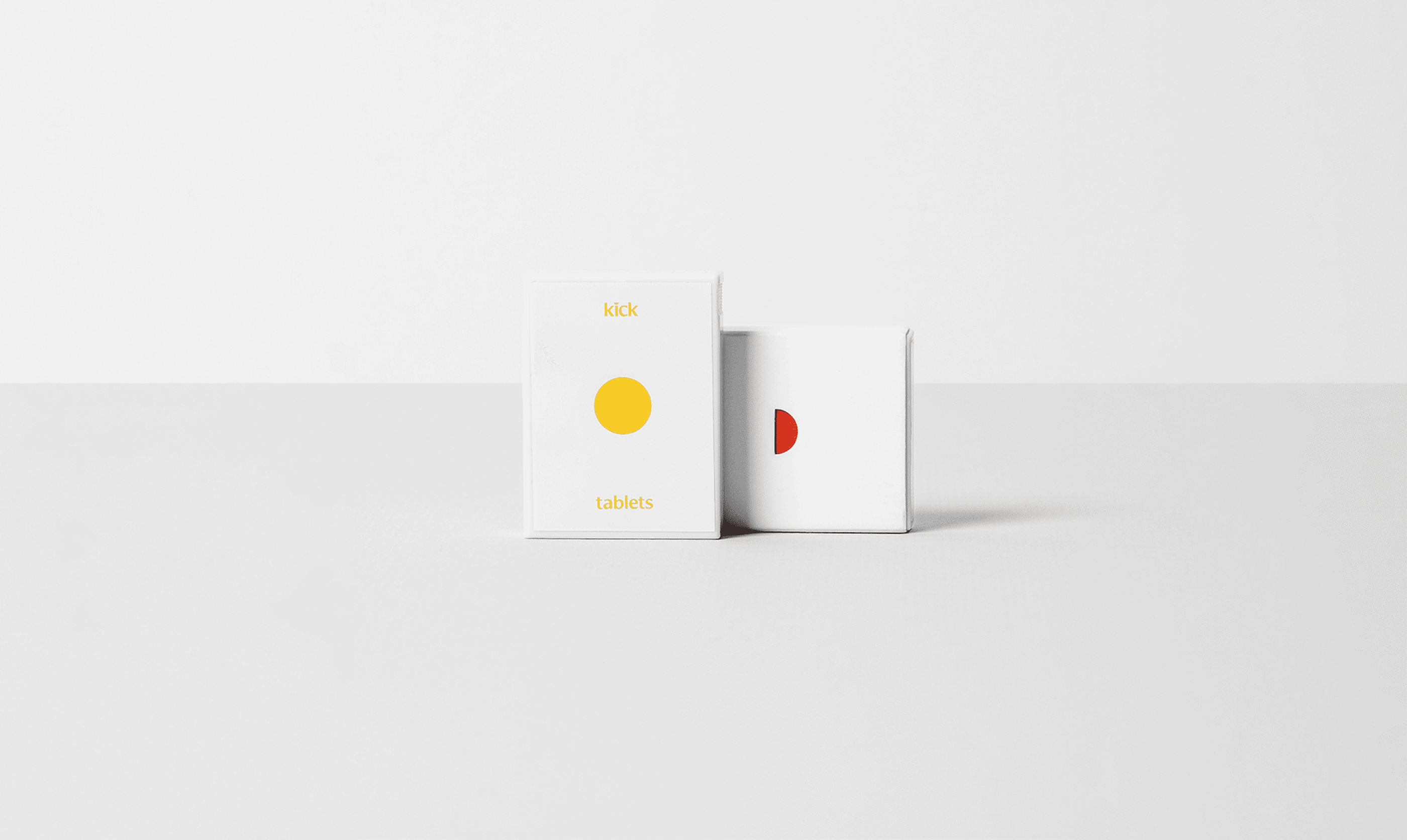
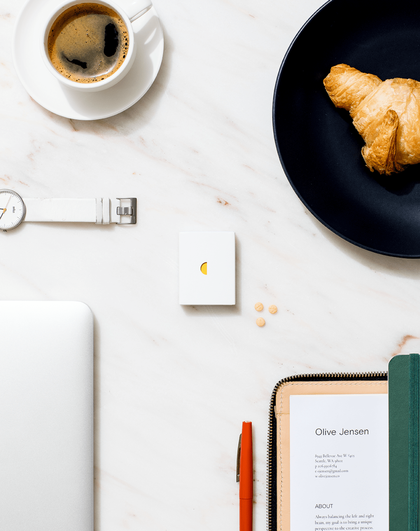
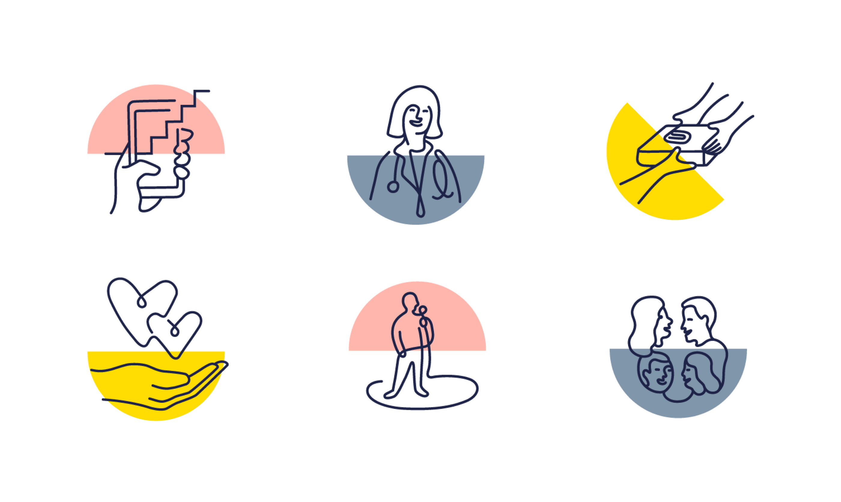
We saw an opportunity to position users as self-aware, ambitious, top-of-class people and Kick as the call to action they need to be 100% themselves, when it matters most. The identity uses a friendly, but bold typeface and color palette alongside a scalable illustration system that utilizes a mono weight line drawing to evoke a feeling of imperfection balanced with a semi circle that provides structure and balance. On their own, the full and half circles can be used to create patterns and representational graphics. Our work extended into several campaigns used across social media and paid advertising including photography, video, illustration and animation.